Brand Illustration & Design System



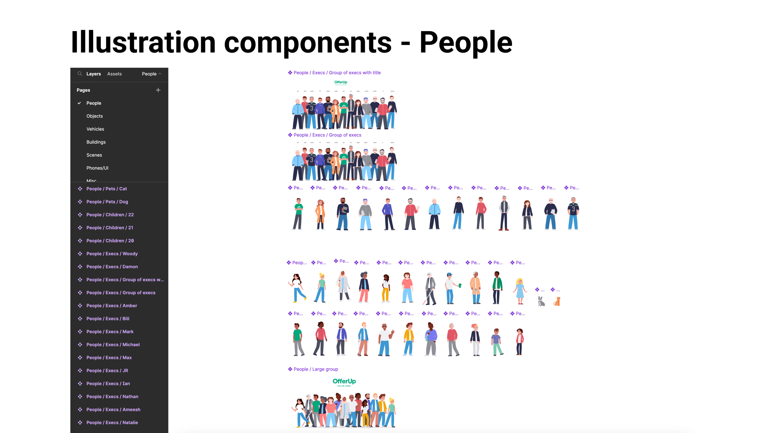
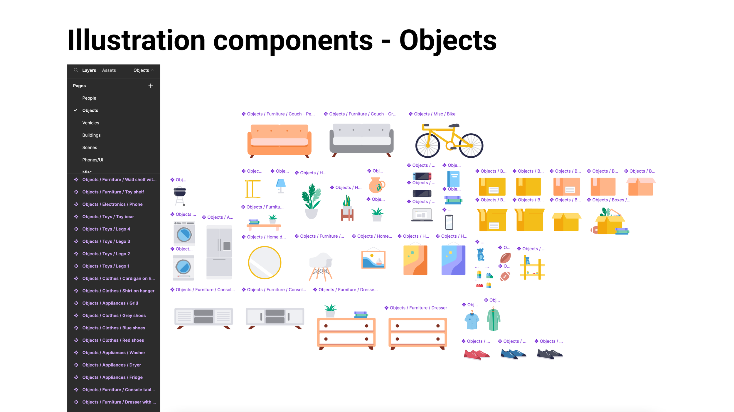
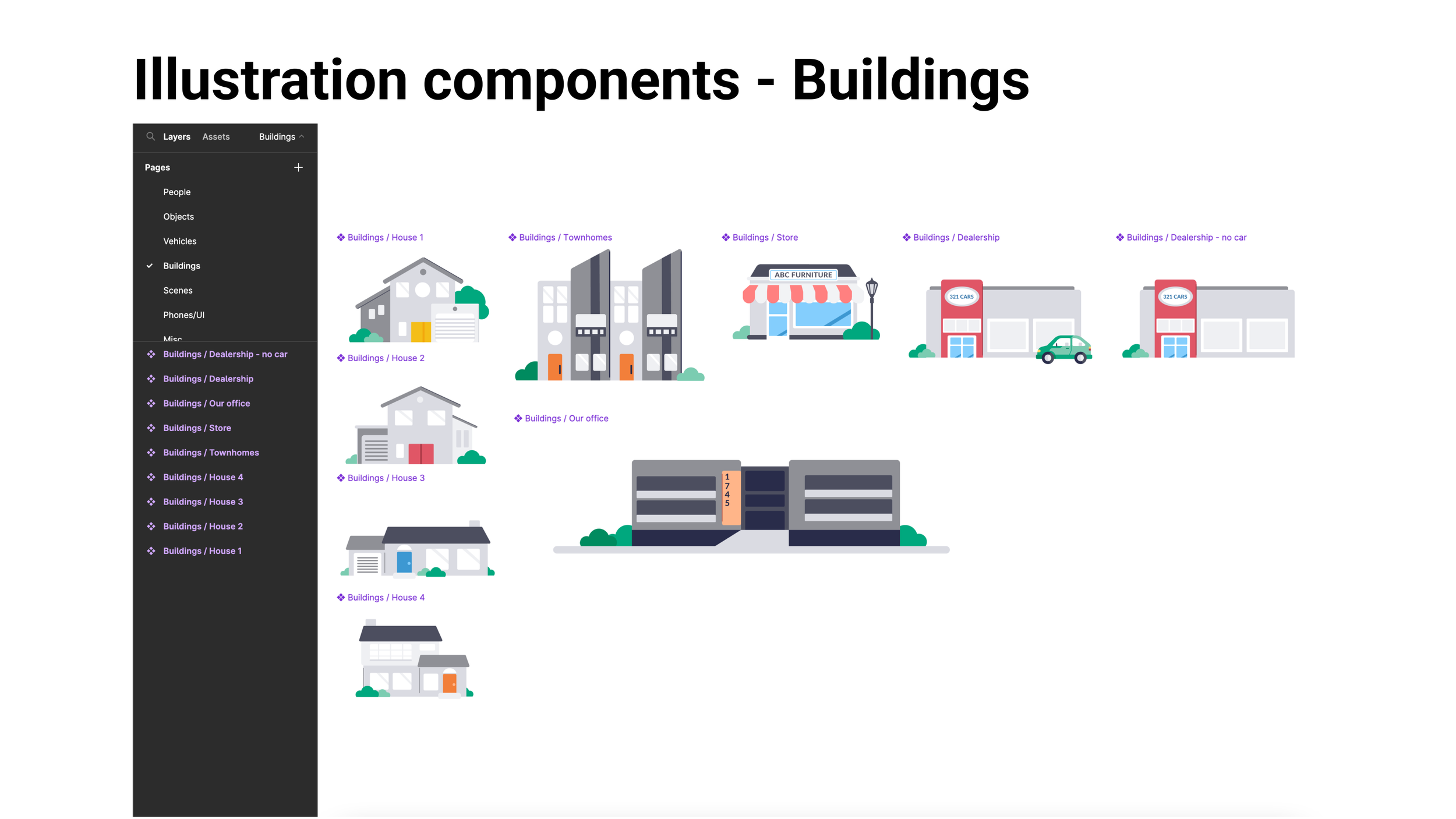
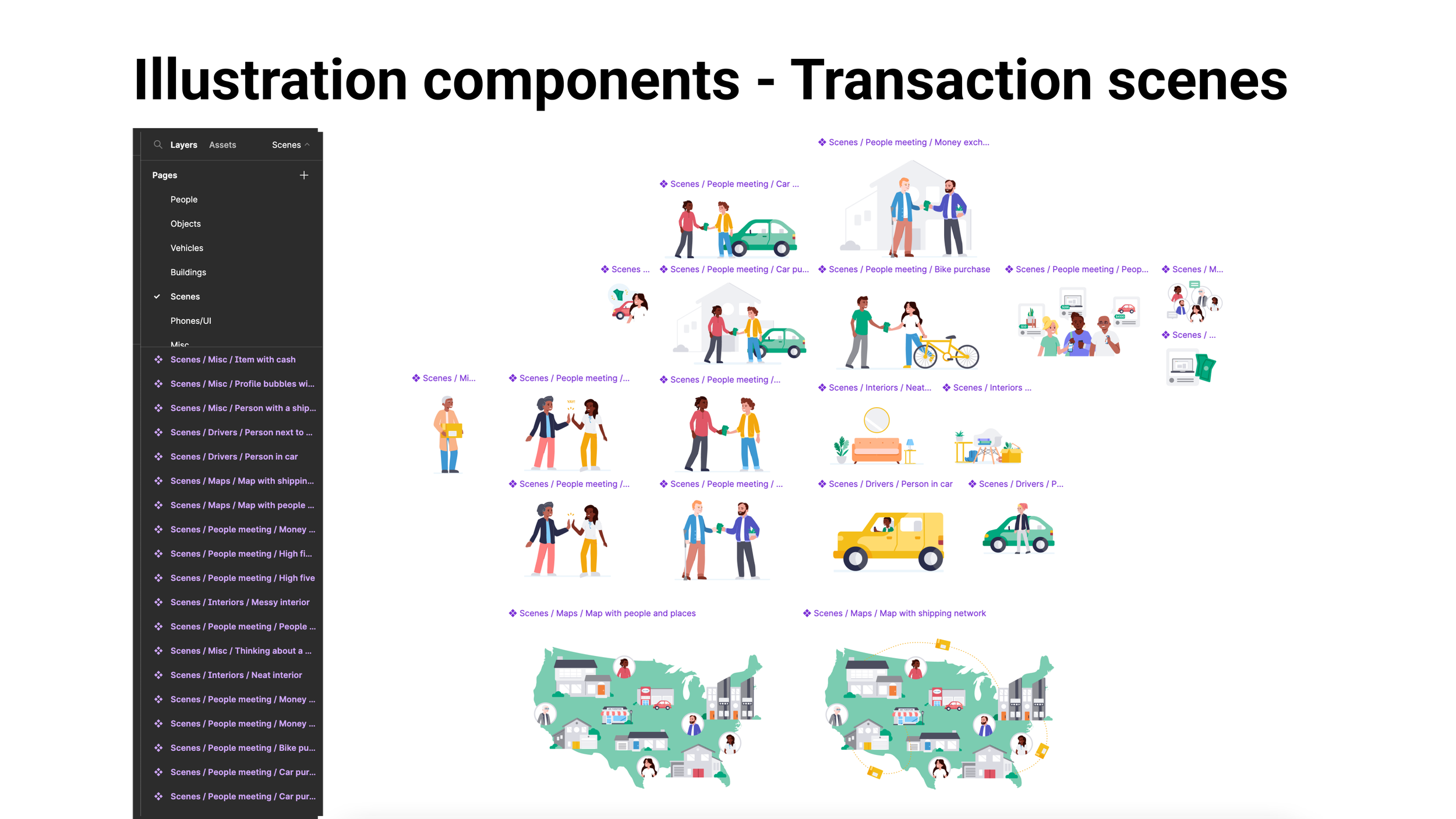
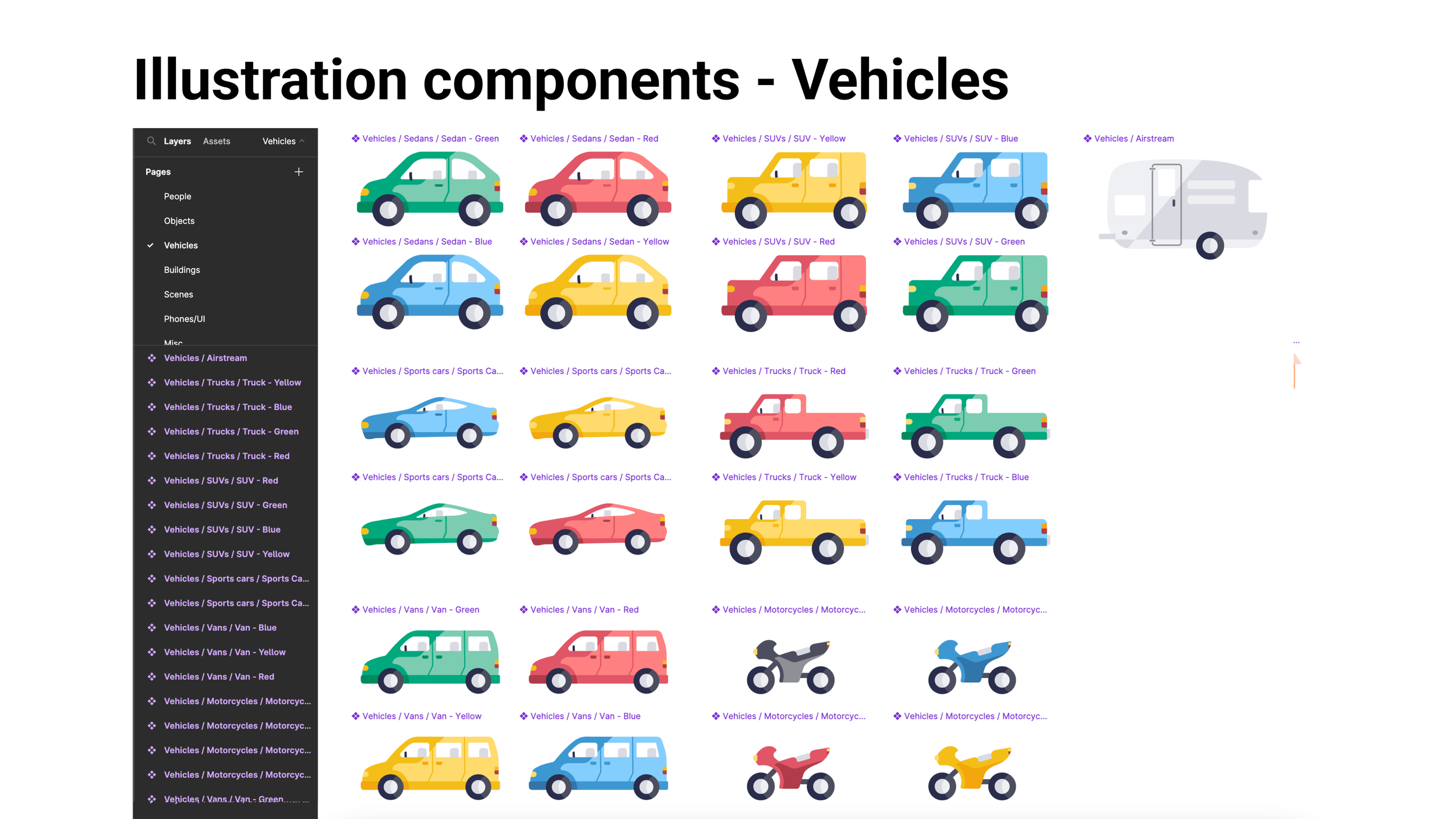
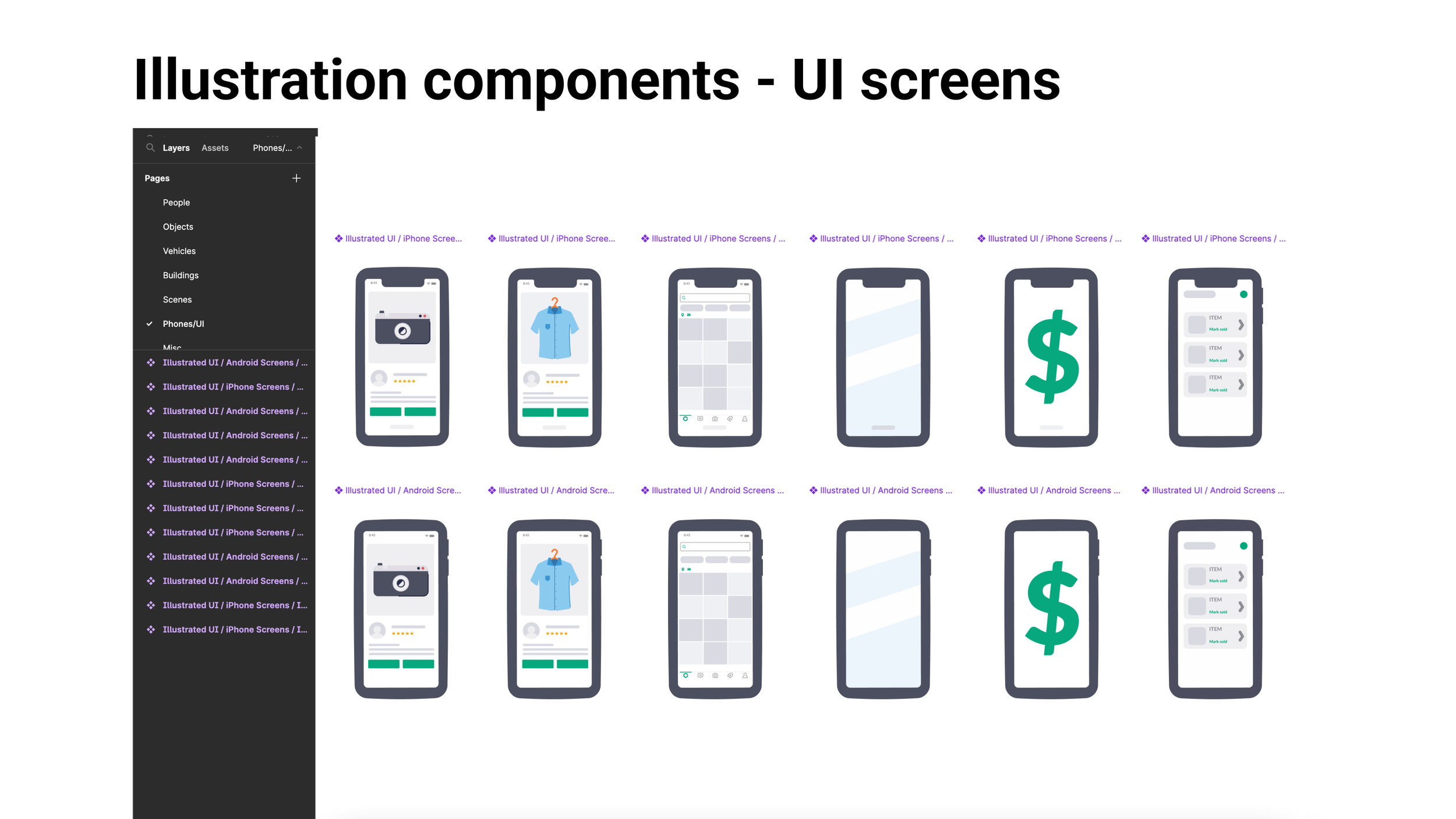

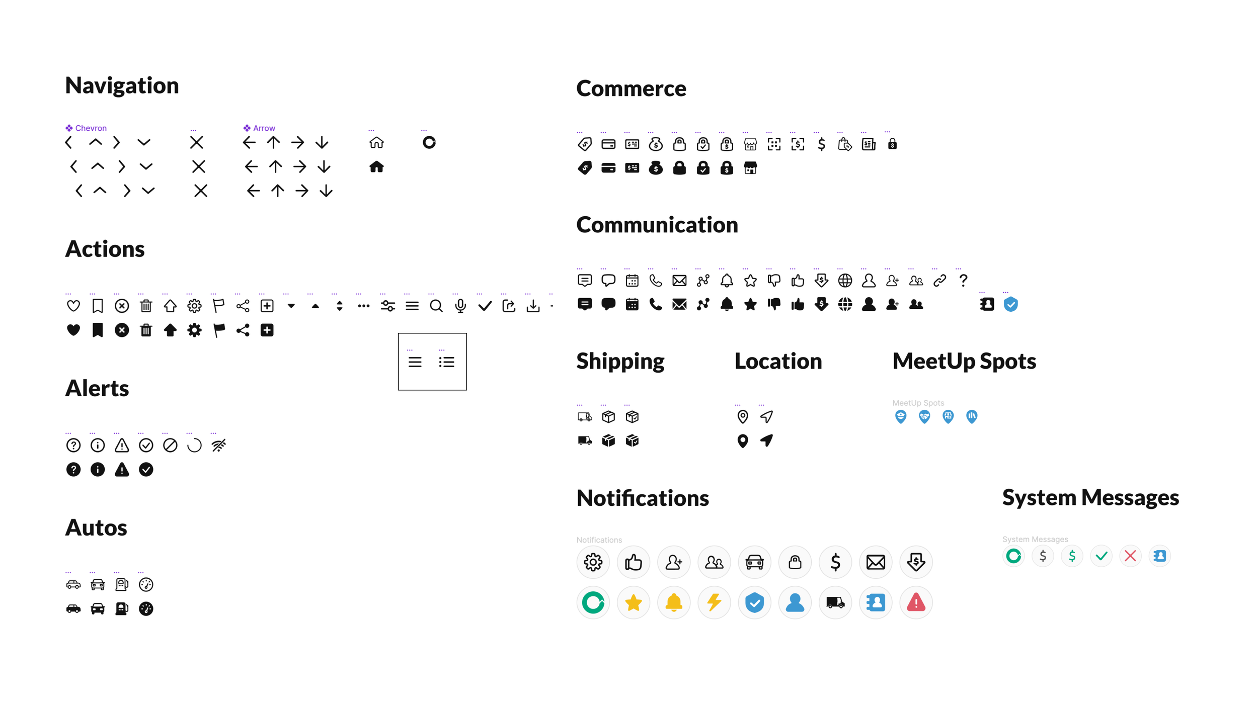
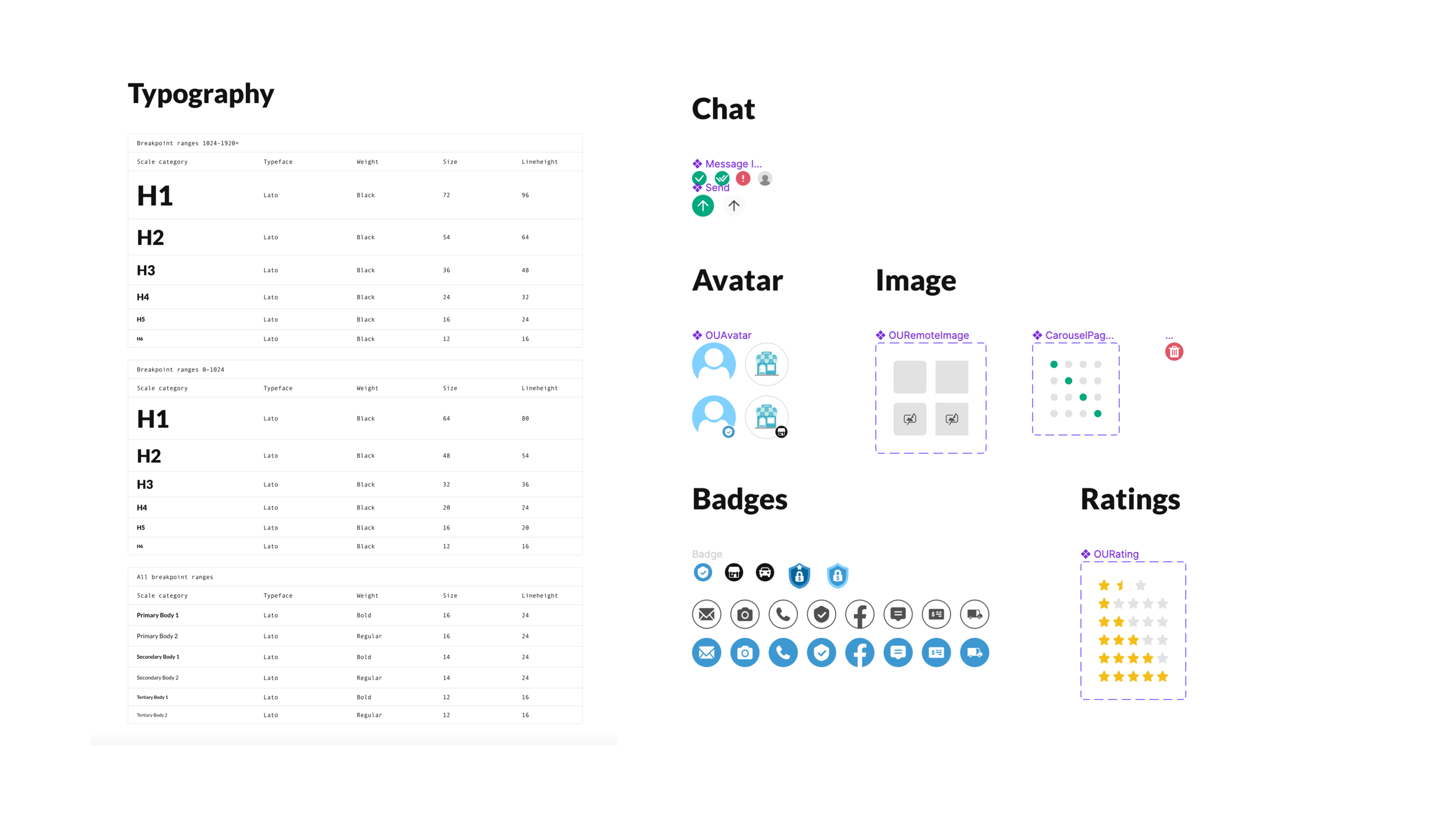

Deep dive of OfferUp illustration system

The research behind starting the system
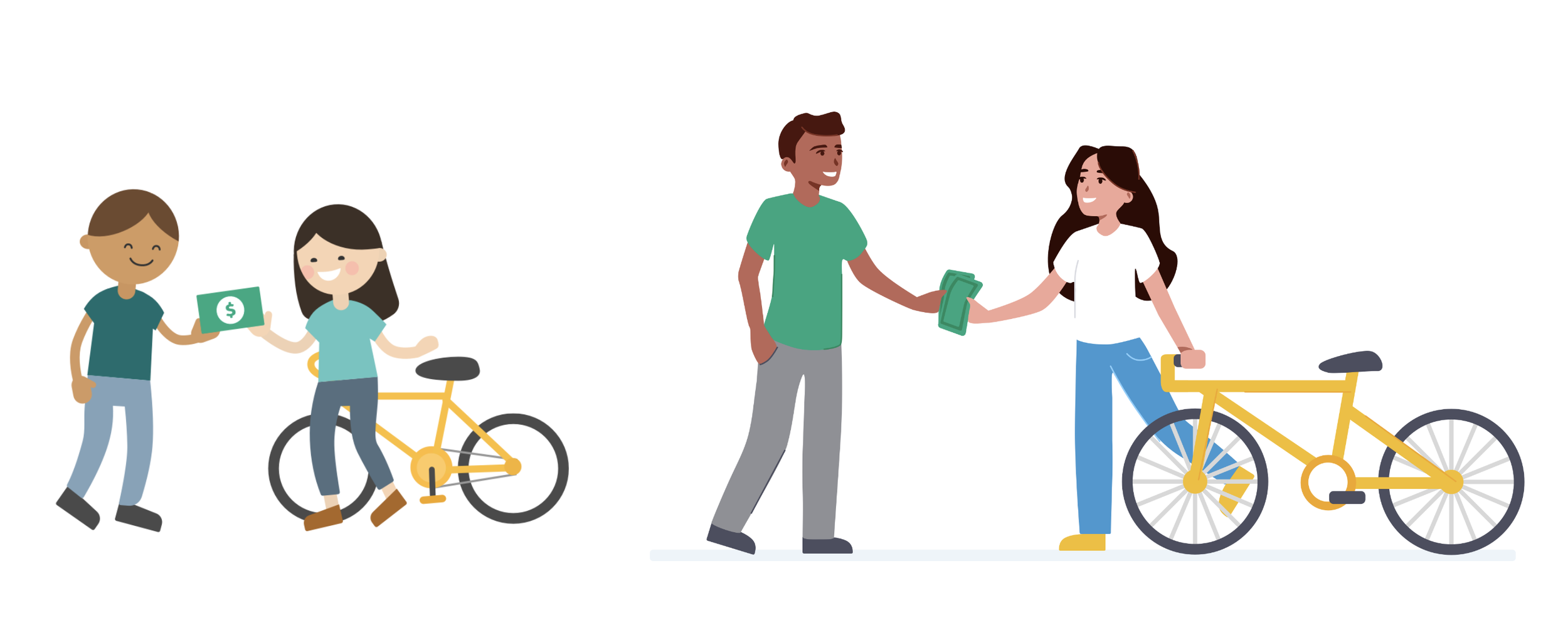
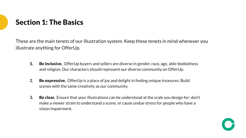
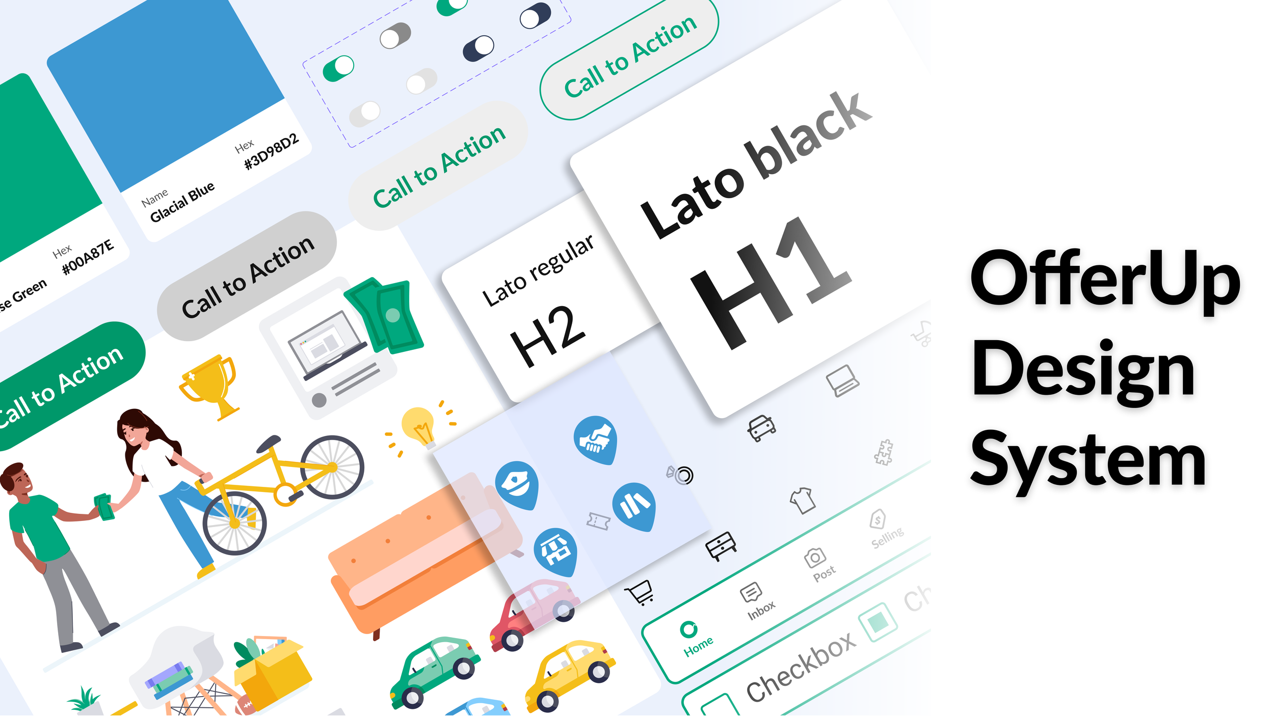
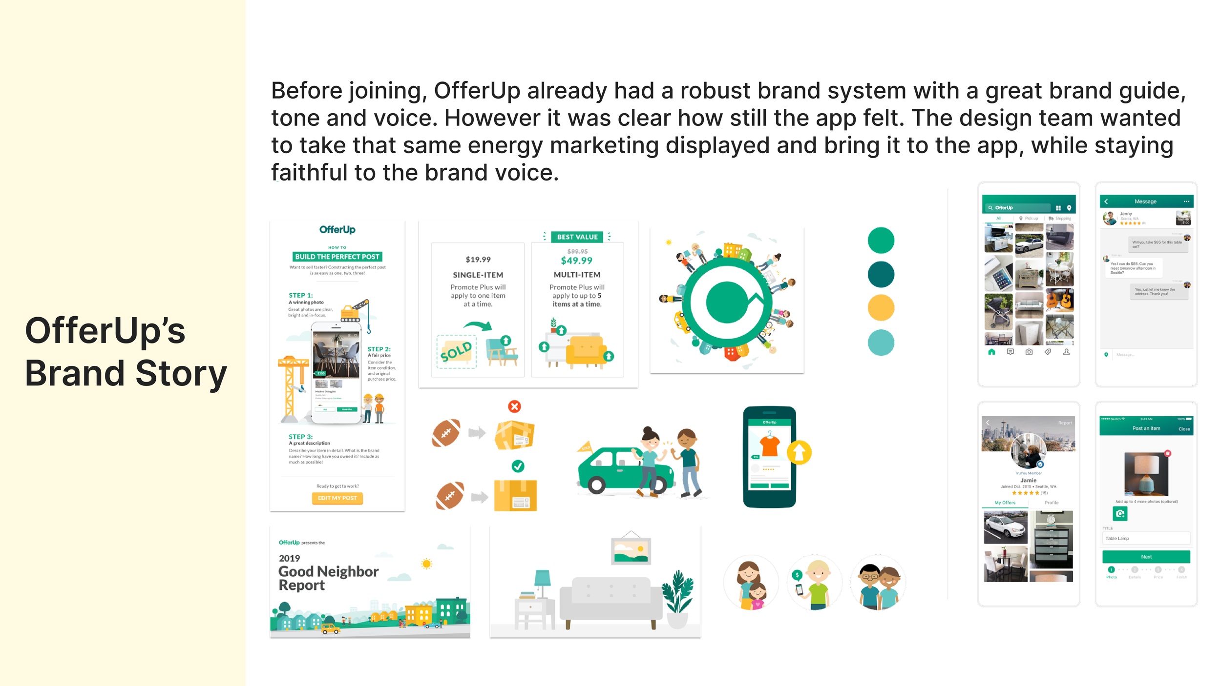
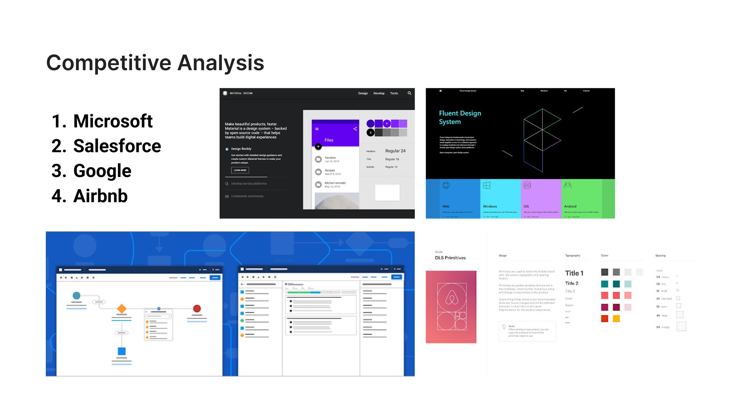
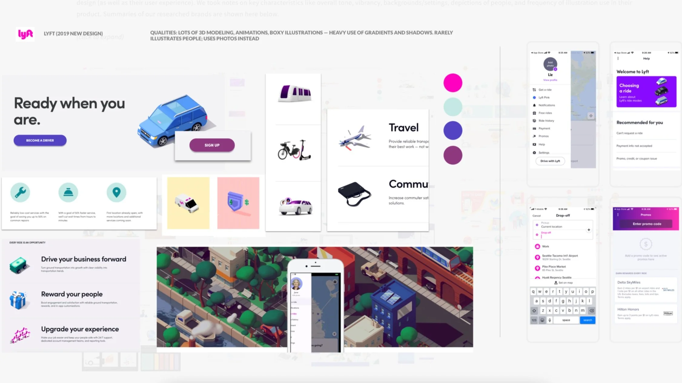
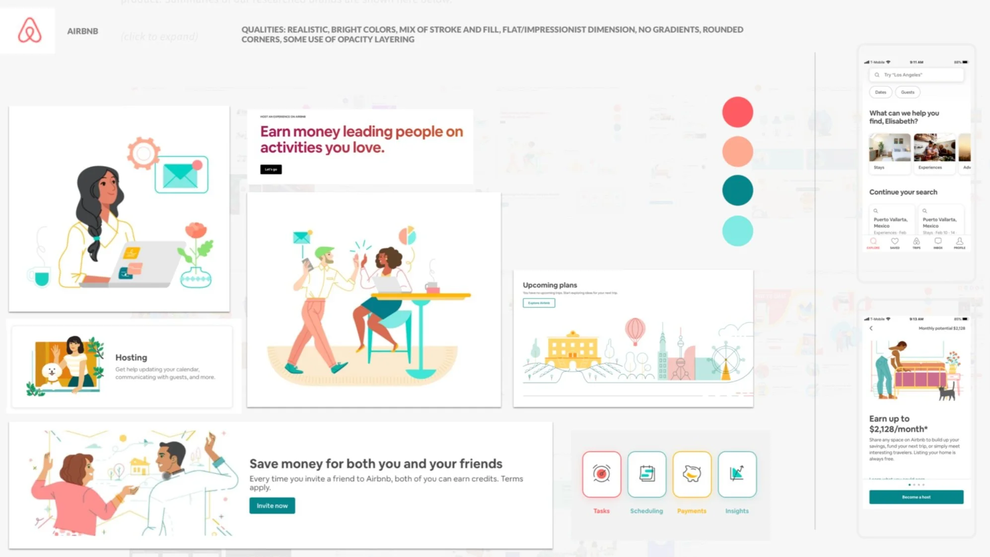
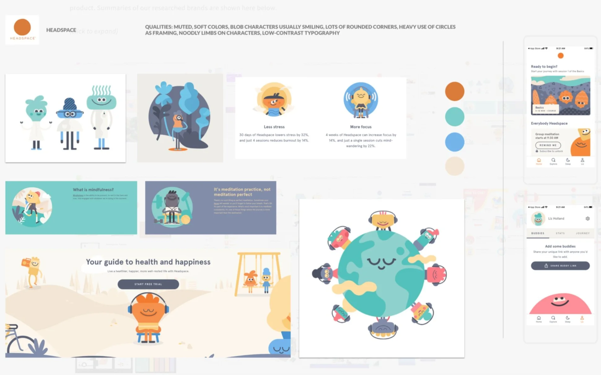
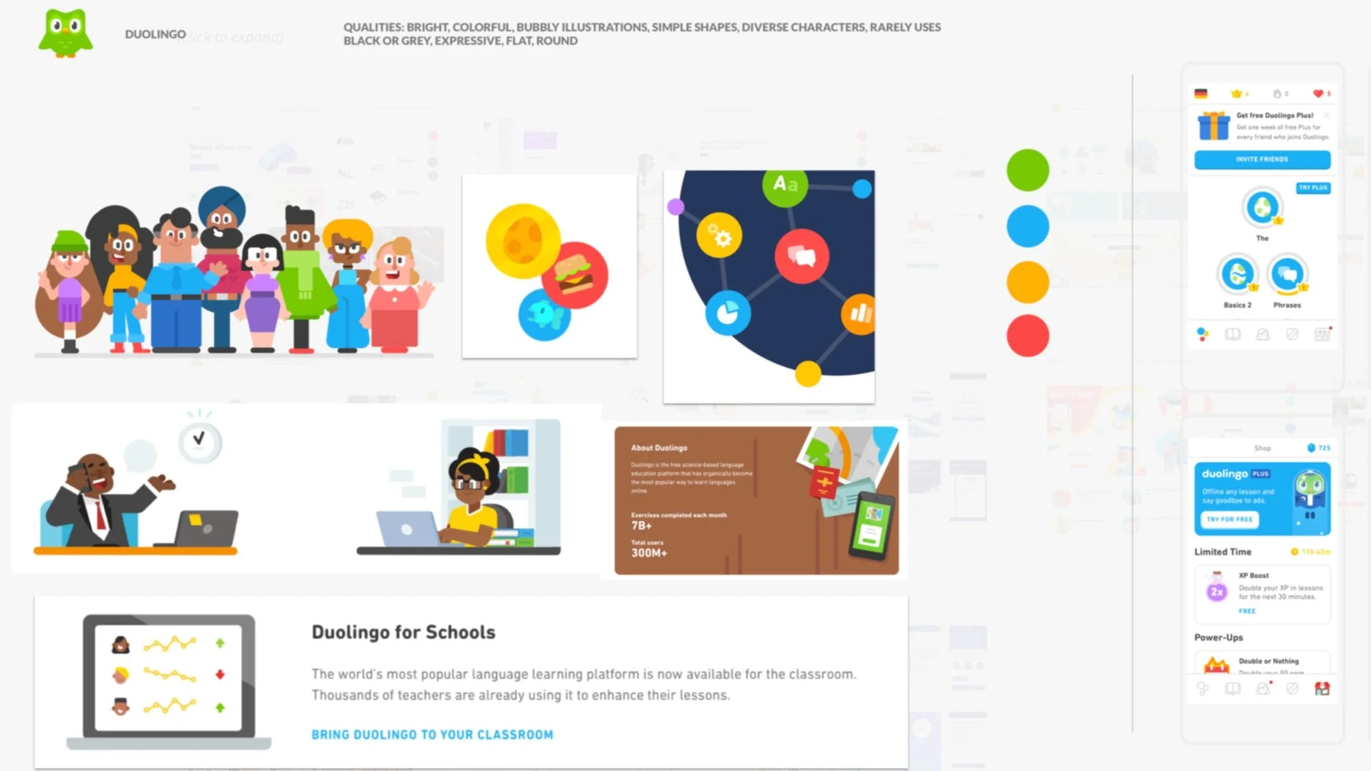
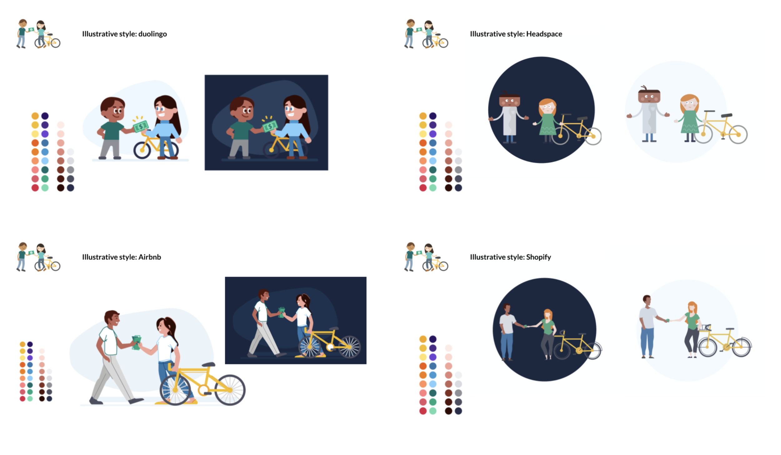
The first step in this project was pulling examples from the best-in-class leaders in visual design, and understanding what makes their illustration system work well with their overall visual design (as well as their user experience). We took notes on key characteristics like overall tone, vibrancy, backgrounds/settings, depictions of people, and frequency of illustration use in their product. Summaries of our researched brands are shown here below. We also took time to dig into our own brand. The OfferUp illustration style had been around since late 2017. It was built with the idea of simplicity and friendliness.
Speaking to key stakeholders across the company, we collected feedback on what people liked and did not like about the OfferUp illustration style. A few key “likes” and “dislikes” stood out across the board.
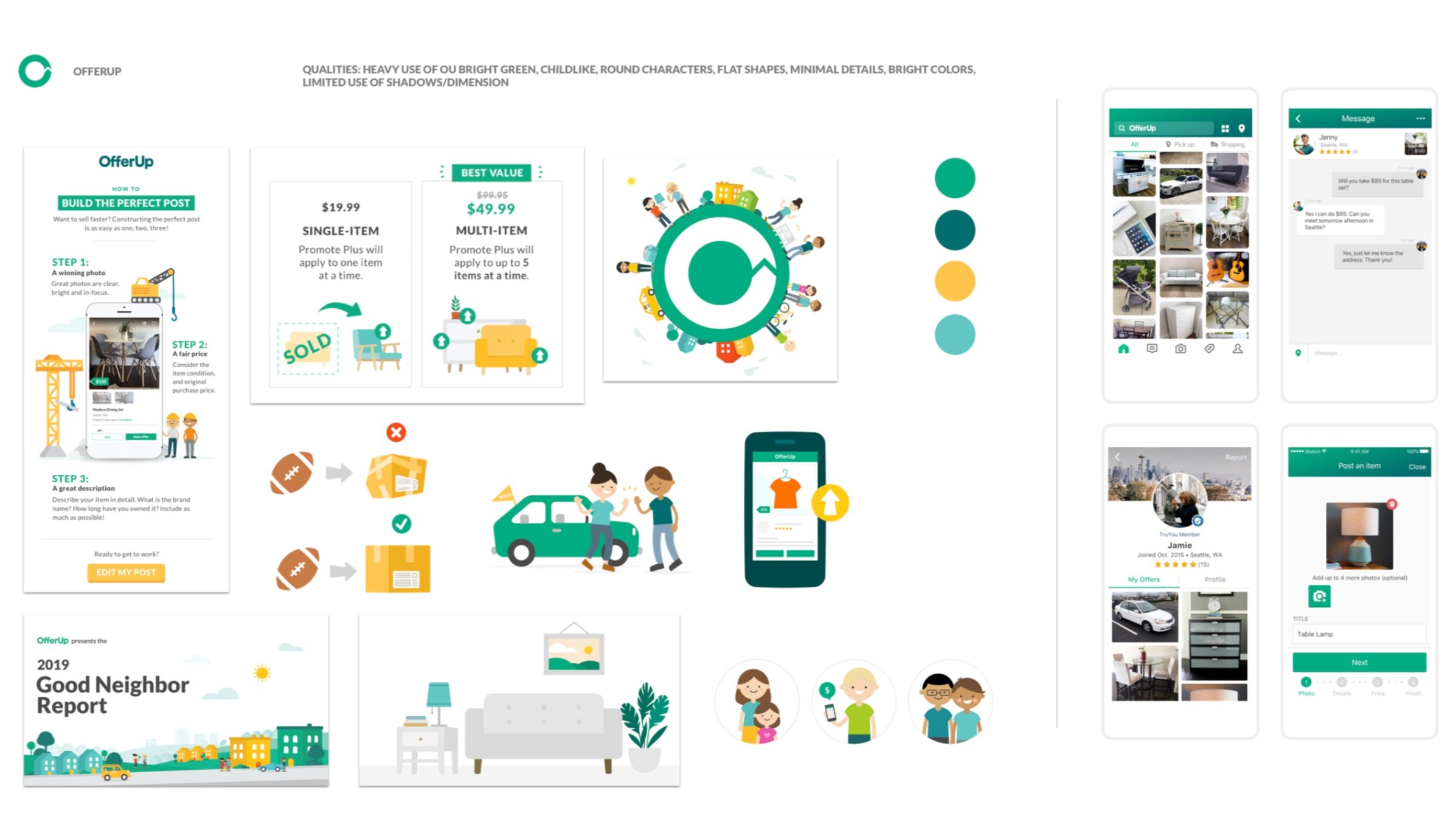
Likes: Friendly, cheerful, easy to see on a small screen, bright, fun
Dislikes: Too childlike, “looks too much like a kids’ drawing”, too bright, not appropriate for serious/business settings
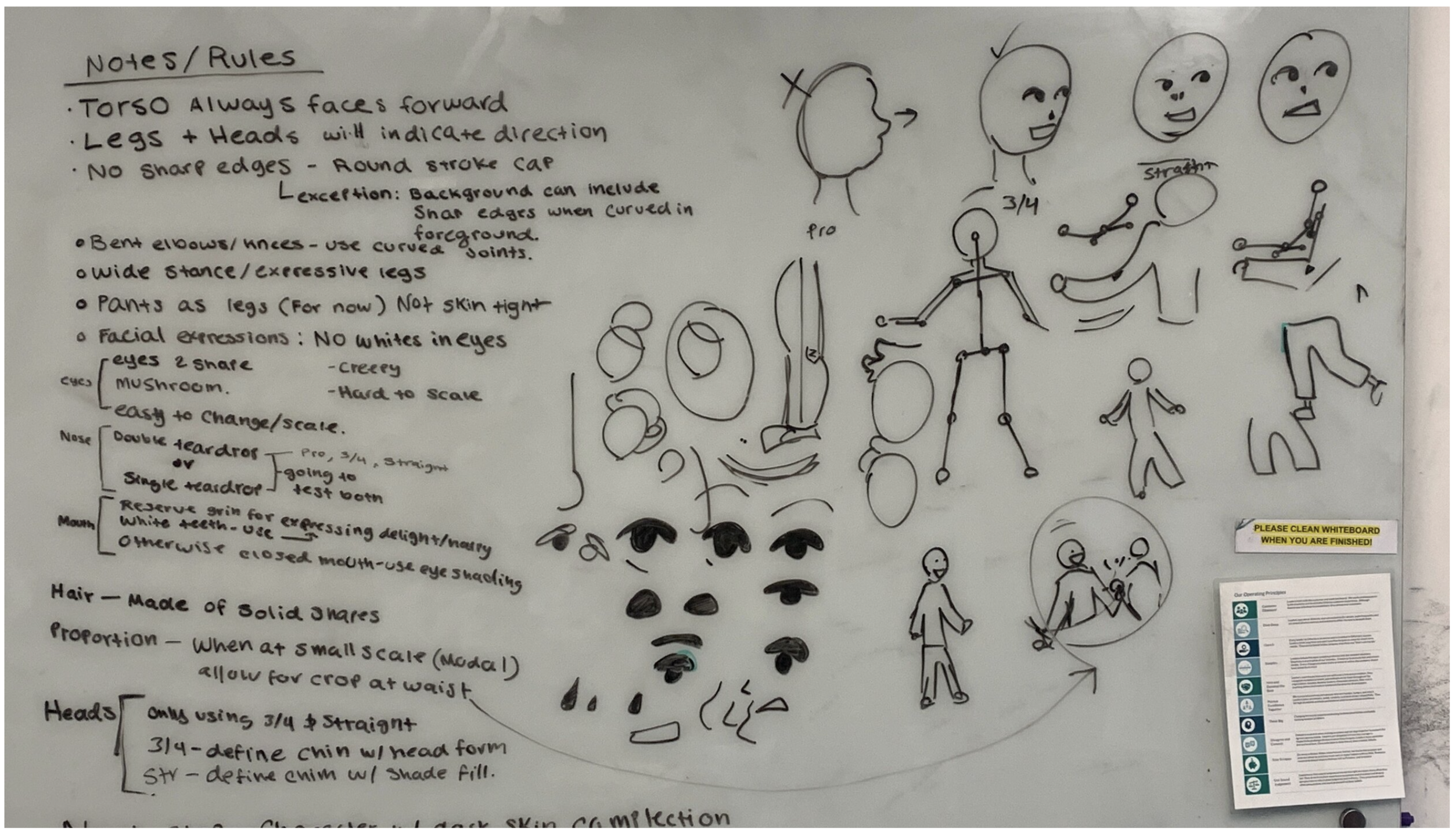
After conducting visual research, we started to read up on best practices for establishing a new illustration system, including interviews, case studies and other related readings from industry leaders. Some of our favorite pieces we chose in our research are listed here:
Meet the Illustrator Diversifying Airbnb's Image
https://www.wired.com/story/jennifer-hom-illustrations-airbnb/Meet the illustrator behind Duolingo’s crying owl
https://www.invisionapp.com/inside-design/duolingo-redesign/Case studies: Airbnb
https://design.studio/work/airbnbUber Brand System
https://brand.uber.com/guide
After
Before